
Latus Medical Care
B2C , Healthcare
Branding // Design // Strategy & Planning
In the healthcare system today, primary care doctors’ offices juggle an overwhelming number of insurance providers, all with different kinds of coverage. This often leads to a recommendation for a specialist or procedure that isn’t covered when the same care is available elsewhere in town.
That’s why a new practice concept arose, focusing on only patients with insurance from BlueCross BlueShield. That way, patients are always covered, and their care providers know the ins and outs of coverage, so they can make choices that provide in-network options with fewer insurance guesses. Genius, we know.

So with this incredible care-centered concept, we were hired to come up with the full brand strategy, from positioning and value proposition to visual identity, name and logo mark, style, tone and messaging. In our line of work, that calls for filling our notepads with big dreams and endless possibilities.
One of those ideas stemmed from a lattice pattern sketch. Inspired by lines that both connect and branch out to create their own unique paths, we came up with the name Latus Medical Care to embody the connected and comprehensive care delivered exclusively to BlueCross BlueShield members.

Once we had the name, we began to think about bringing the brand strategy to life in the medical center. It got us thinking, if doctors’ offices are supposed to make you feel better, why do their spaces feel so cold? So we set out to show our client how they could differentiate Latus with an office space that feels as if you’re walking into a spa. To demonstrate to our client the value of this first impression, we staged the space for our next meeting with an aromatherapy diffuser, soft lighting, plants, spa tunes and the light trickle of a waterfall. As the clients walked in, each received a Latus-branded bag with a healthy breakfast snack, fruit and water.
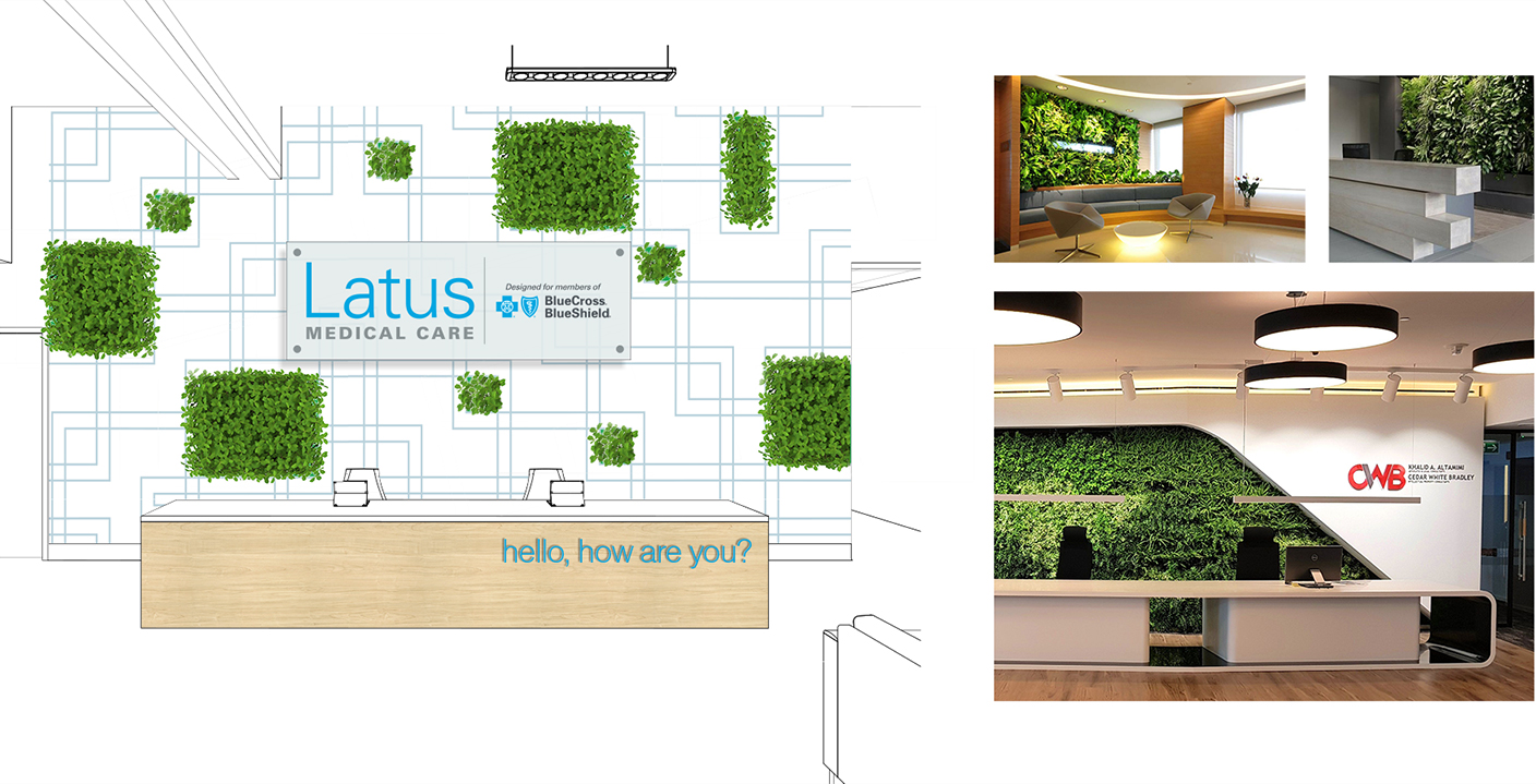
Once the client got a dose of our brand strategy and activation and how good it made them feel, we partnered with a local architectural company to make this physical manifestation of the brand a reality. Our work included determining the aesthetic of each room, creating job titles, naming rooms in the office space, and bringing to life numerous other elements of the brand. In short, we created a soothing environment that broke the norms of most doctors’ offices.
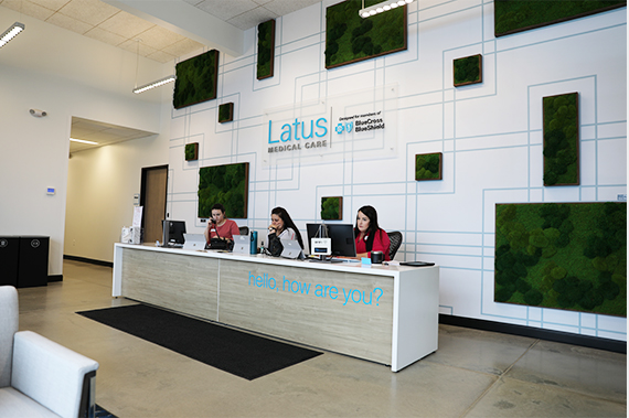
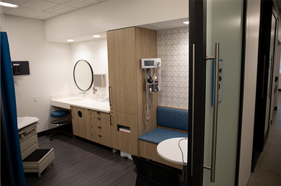
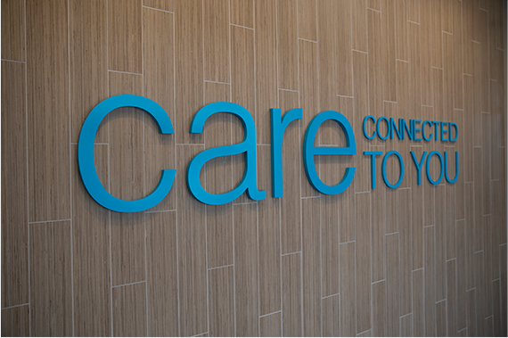
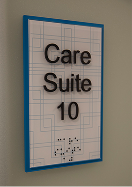
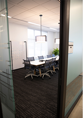
The office soft-launched with rave reviews about how it drastically differed from the competition. The brand and messaging resonated with the target audiences, giving them confidence that they would get the right care and coverage in one trusted place. We simply helped to create a physically and emotionally supportive environment for care delivery that’s been missing in the medical industry. But hey, that’s just what friendship’s all about. Because, when a friend is hurting, you want to make sure they have the right support, and they don’t have to pay the arm or leg they hurt to get it.
We helped Latus Medical Care get the word out on a new style of healthcare and gave the care center a look and feel that focused on luxury like no other care in town. When members received our messaging that there was a new medical center dedicated to them, they felt connected and protected—and even more loyal.
Key Brand as Friend® drivers:
Hey! Our name is pronounced Mōw-rrr, like this thing I’m pushing.